
My Chief Marketing Officer Print Portfolio
Whether it is for your trade show, networking event, or bus ad, My Chief Marketing Officer has a diverse print design portfolio and print marketing collateral. Explore the many different executions of client’s brands across eye-catching flyers, professional business cards, crisp looking brochures, and many other print marketing projects that have yielded optimum results.
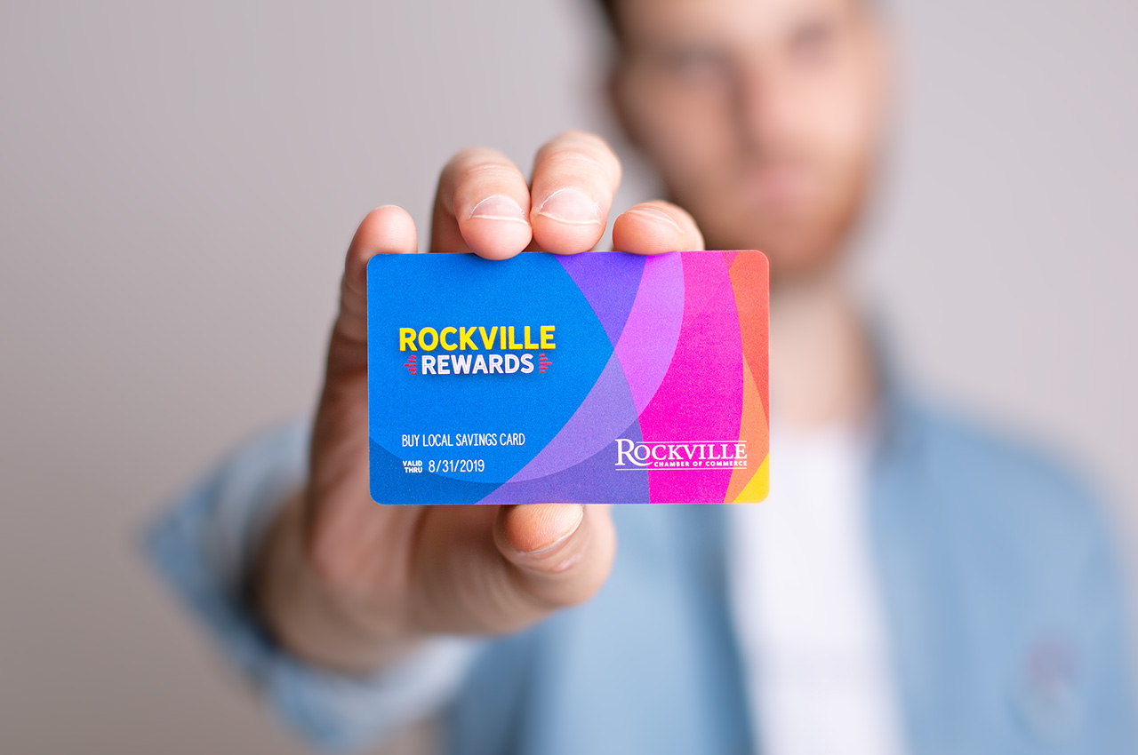
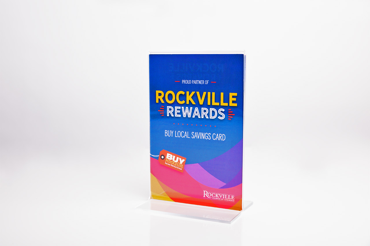
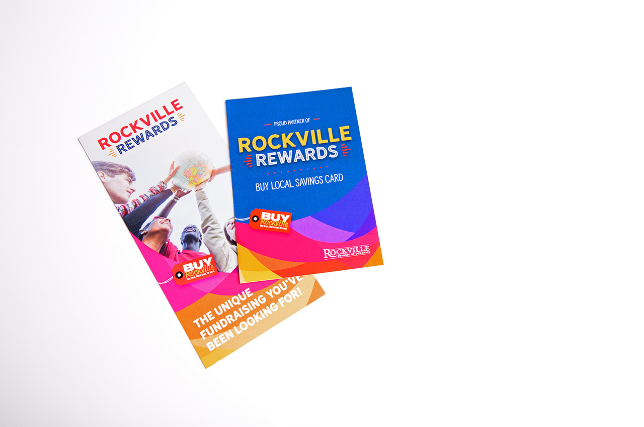
Rockville Rewards
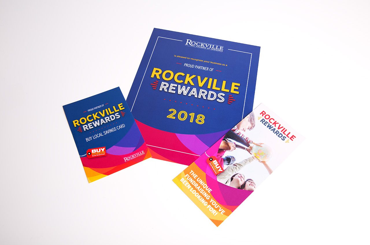
Support local and save with Rockville Rewards; Rockville Rewards is a discount card sold by area non-profits that cardholders can show at partner businesses for a discount. They came to us in need of a newly designed discount card and collateral to support. Using the Rockville Rewards color palette, My Chief Marketing Officer provided an abstract card design as well as a matching rack card, flyer, and brochure. The designs are bright and have a modern and warm look and feel.
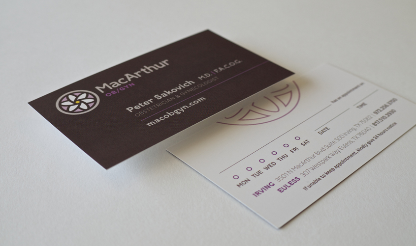
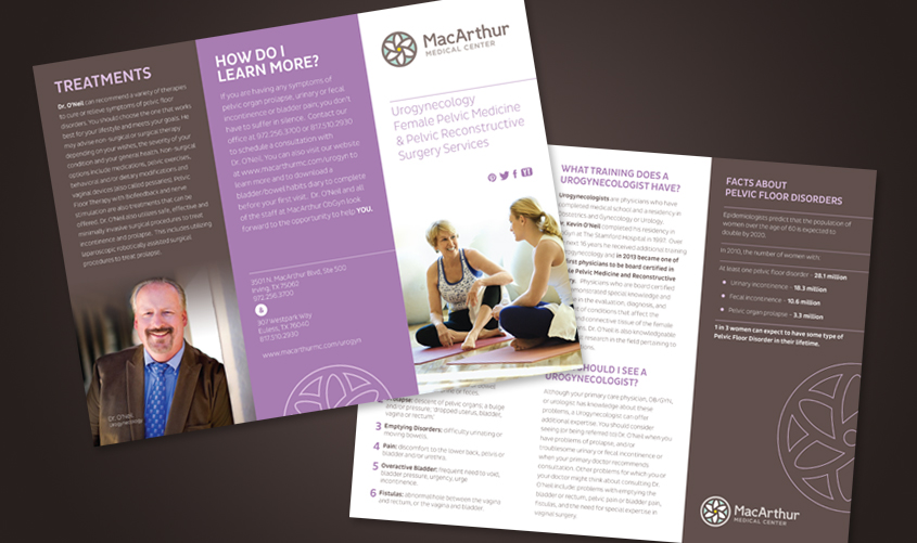
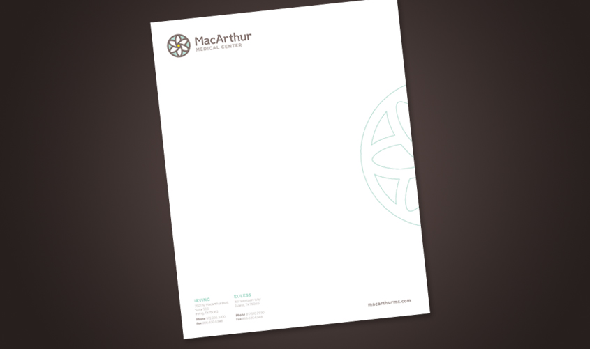
MacArthur Medical Center
MacArthur Medical Center, located in Texas, is a patient care-centered company and leader in obstetrics, infertility, robotic surgery, gynecology and urogynocology surgeries who approached My Chief Marketing Officer in need of an overall brand redesign. My Chief Marketing Officer designed a main logo for the company, expanded the color palette, and assigned a specific color to each specialty that MacArthur offers, then created a sub-logo for each specialty. We use each specialty’s color to brand their unique print collateral pieces, but still maintain the warm, caring feel of the overall MacArthur brand.
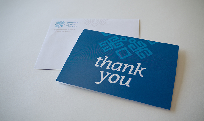
Bethesda Family Therapy
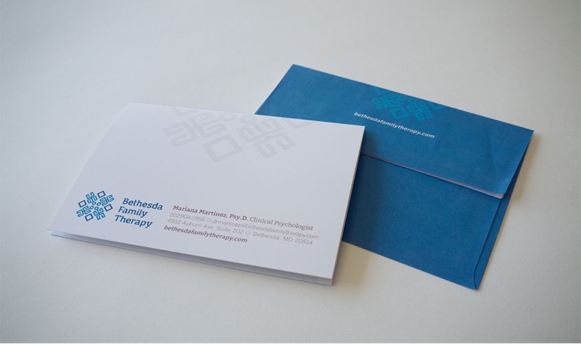
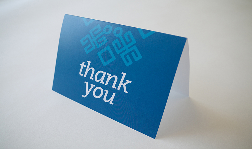
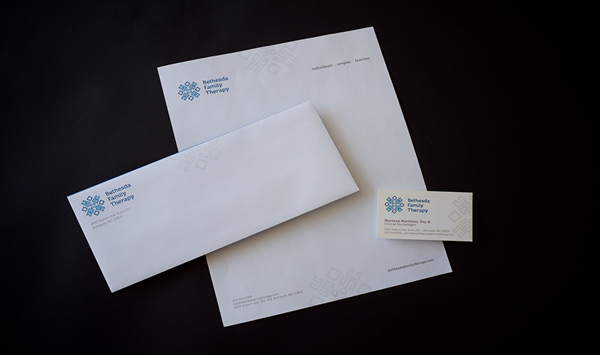
Bethesda Family Therapy offers state-of-the-art psychotherapy based on the Bowen family systems theory, and came to My Chief Marketing Officer in search of an original brand. After My Chief Marketing Officer designed the logo, we used it to create the rest of the collateral for their corporate identity. The collateral design is clean and professional, and helps establish a consistent, distinct brand. The icon is split in half to visualize the idea that Bethesda Family Therapy can connect two disconnected pieces and create a “whole” – for example, bringing people back together to mend relationships, help them see the whole picture, or feel better overall.

FirstTeam VIP Health Services
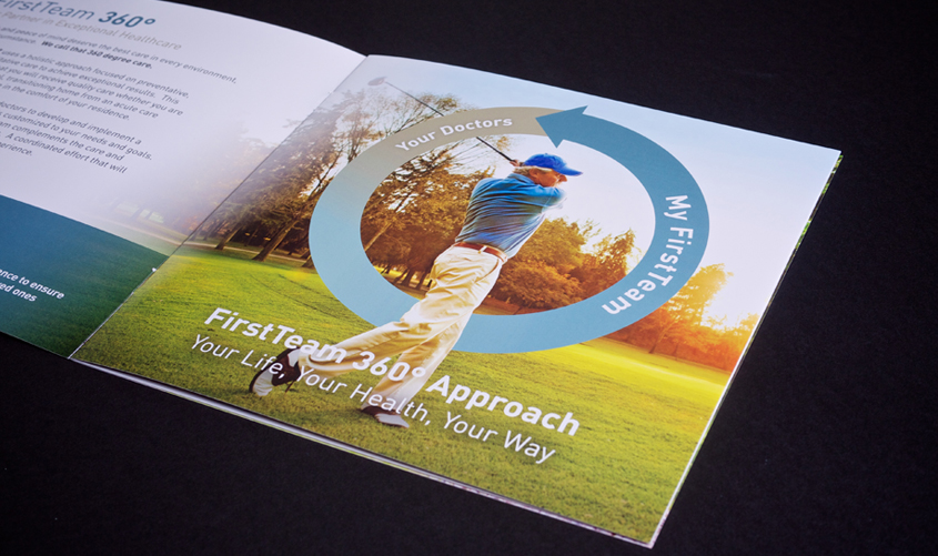
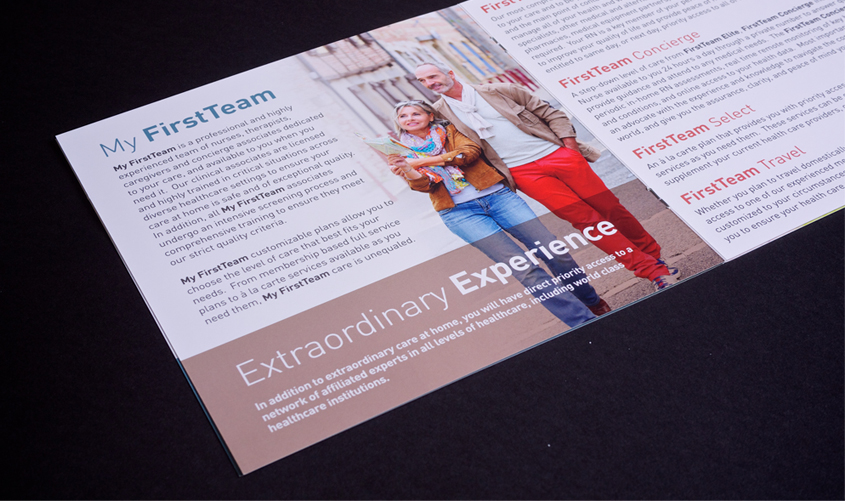
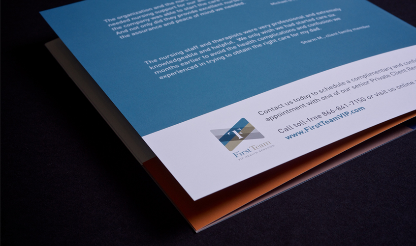
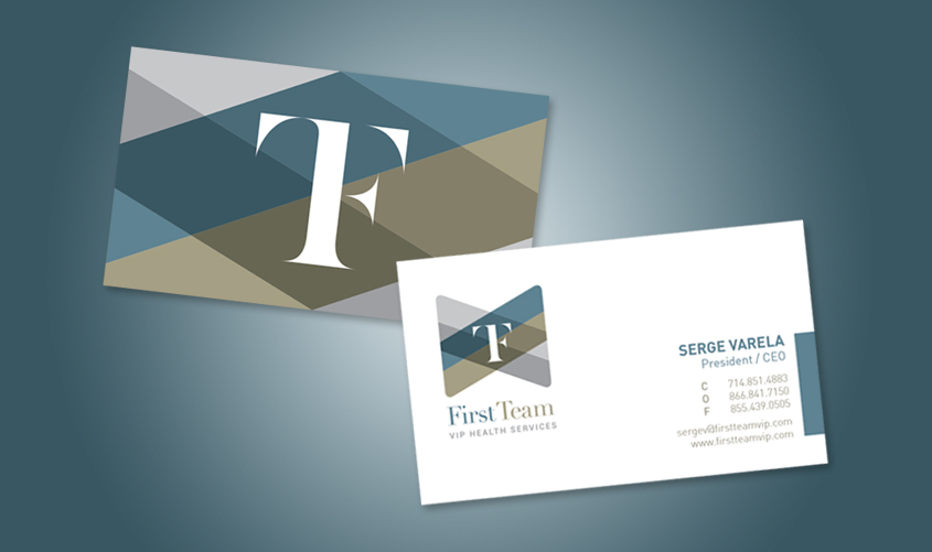
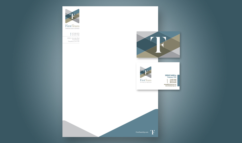
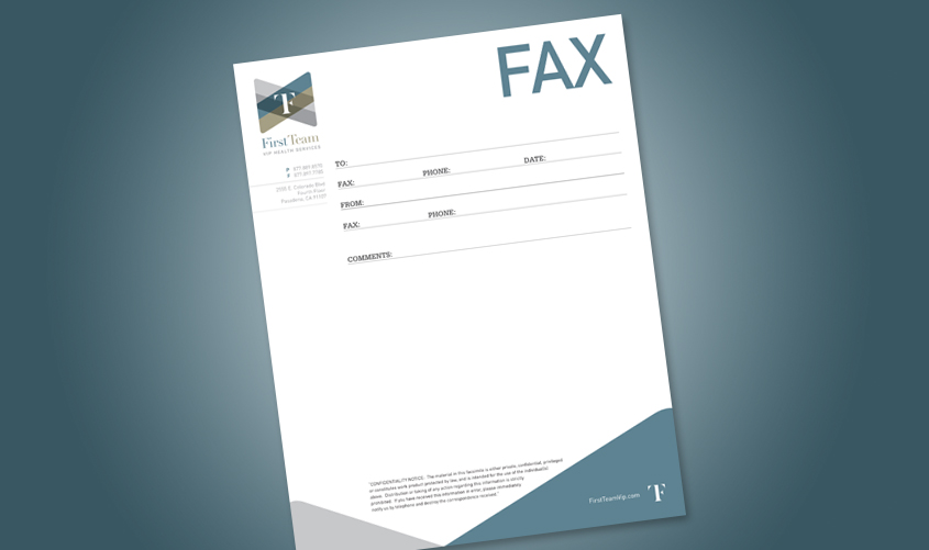
First Team VIP Health Services is a personal at-home care provider that needed a new brand. After My Chief Marketing Officer designed the FirstTeam logo, we used the same elements to create a consistent look across all of the corporate identity collateral. The collateral has a clean, corporate design and emphasizes the FirstTeam logo. This is important in establishing the look of a new brand.
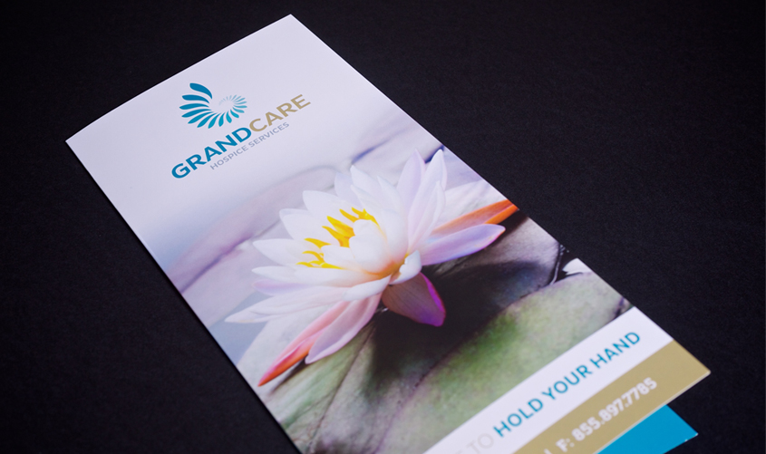
GrandCare Health Services
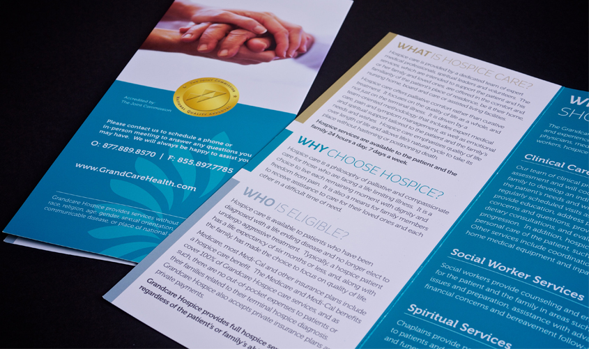
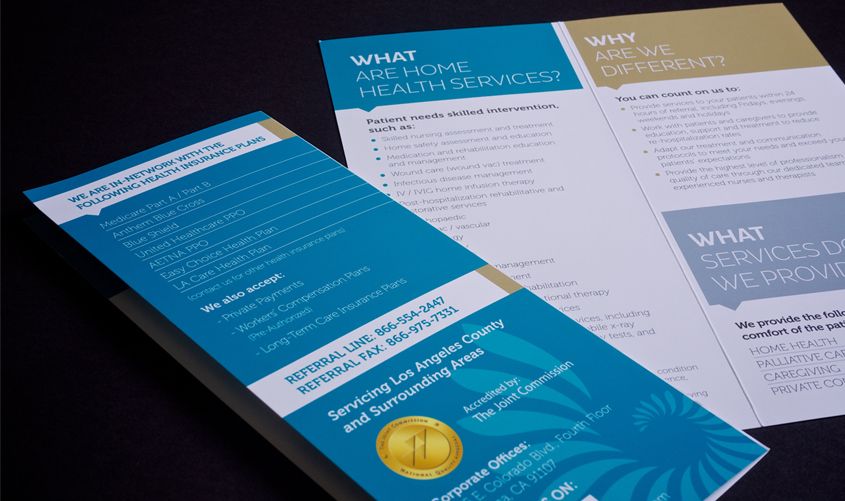
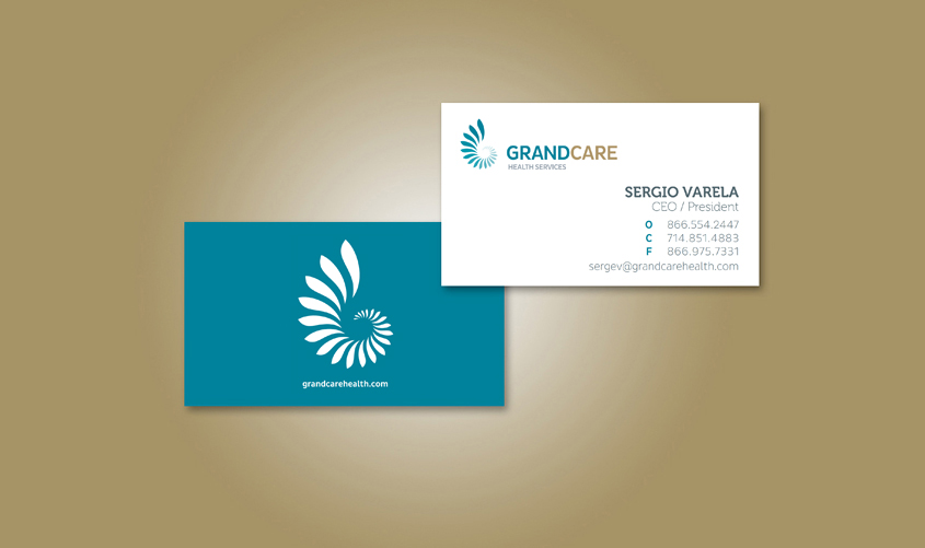
GrandCare Health Services is a leader in high-quality home nursing and rehabilitative care, located in Southern California. The company approached My Chief Marketing Officer to update their brand, but maintain their established image. While creating GrandCare’s collateral, My Chief Marketing Officer relied on symmetry, comforting imagery, and bold chunks of solid color. The blues and golds simultaneously establish GrandCare as prestigious and capable, as well as inviting and caring. The clean layout of the collateral offers a modern update to the traditional company image.

Montgomery County
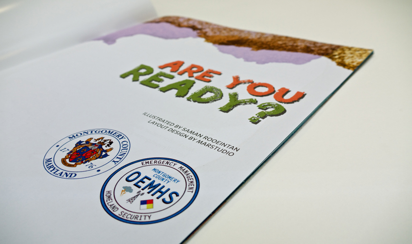
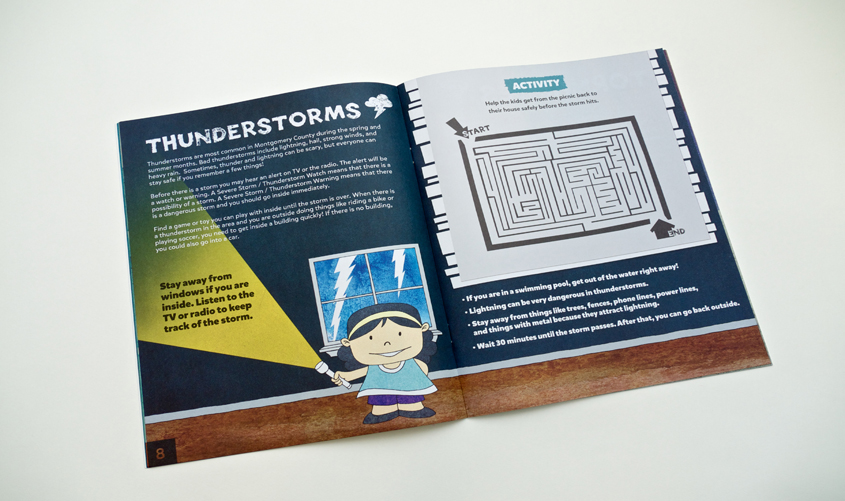
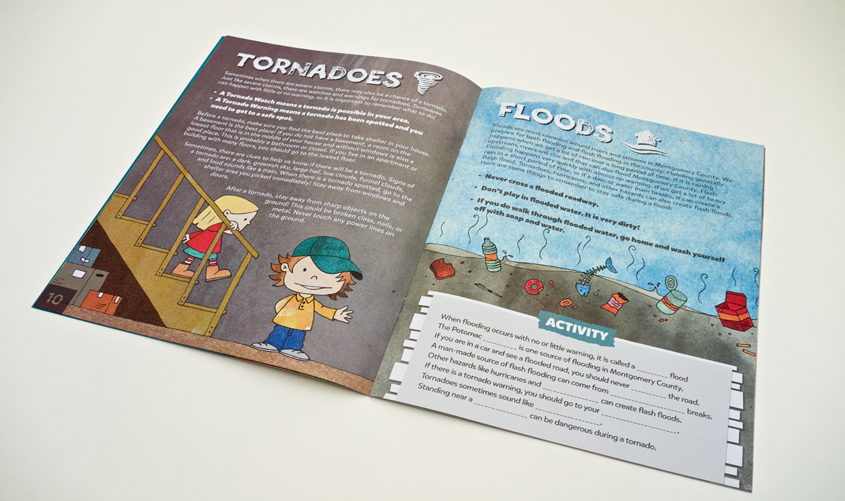
Montgomery County MD, a government entity, came to My Chief Marketing Officer in need of a design (including illustrations and layout) for a disaster emergency preparedness book for children that would be distributed throughout Montgomery County schools. My Chief Marketing Officer had the privilege of working with our local government to create a kid-friendly public service book with My Chief Marketing Officer flair!
Ganti Advisors
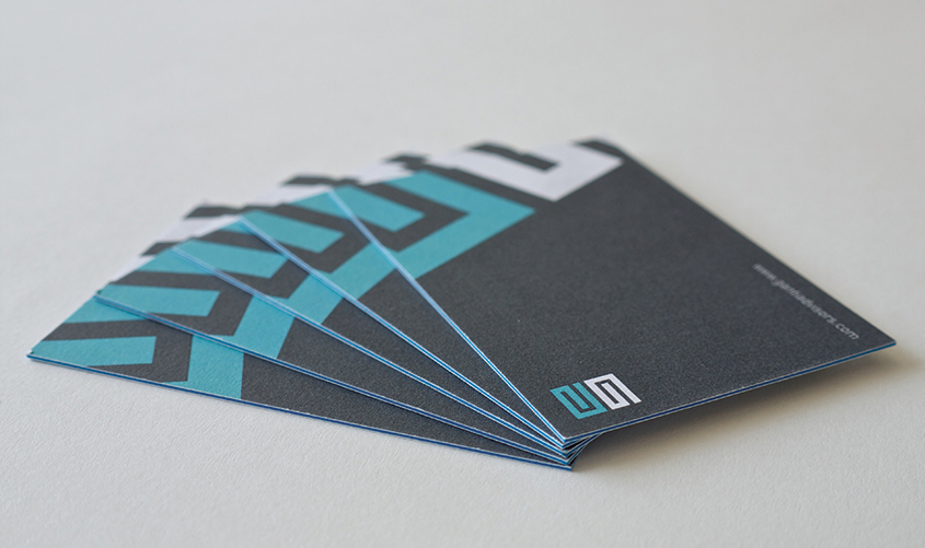
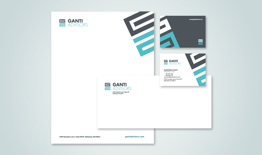
Ganti Advisors is a firm that advises middle market companies and stakeholders and they approached My Chief Marketing Officer for a whole new brand. As with the other print collateral, the GA Icon from the logo was set askew and bleeding off the page. The use of this established design element creates for a consistent brand across all print pieces. My Chief Marketing Officer used the large diagonal graphic of the logo icon to create high-impact, eye-catching business cards for Ganti Advisors. The design is bold and professional. Combined with heavy duty cardstock, these cards are meant to make an impression!
WTOP
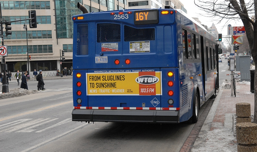
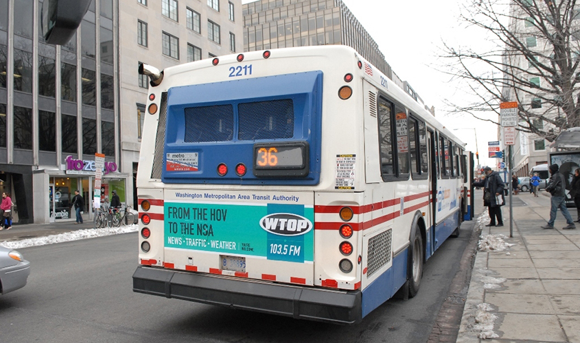
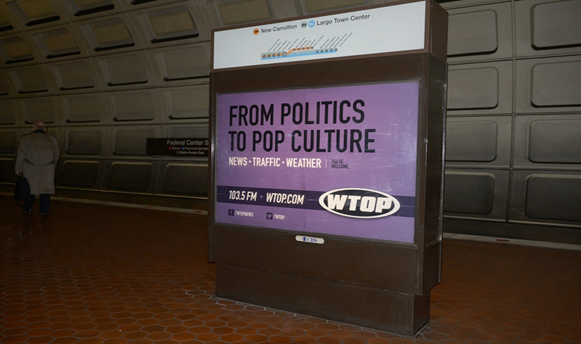
WTOP, Washington’s all-news radio station, engaged My Chief Marketing Officer to design a series of bus ads that would be noticeable on DC area streets. After completing observational research, our team began to develop the content and design concepts. The final ads feature clever one-liners and “A to Z” phrases that are displayed on brightly colored backgrounds. The simple design, crisp font, and bold colors attract attention but do not distract from the important message: tune in to WTOP. These effective bus ads speak to the power of environmental advertising.
Susan Levin
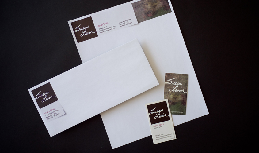
Susan Levin, a prolific local artist, approached My Chief Marketing Officer to prepare a few pieces of marketing collateral. The initial project grew in scope, and My Chief Marketing Officer created an exciting new logo and corporate identity. My Chief Marketing Officer designed clean, modern corporate collateral with a personal touch. The unique, somewhat quirky identity matches Susan’s personality and her artistic preferences.











Burlingame Properties
Burlingame Properties is a unique real estate agency that strives to always do the right thing and treat others as they would like to be treated. Hence, they make sure their audience knows that important fact. They invest a lot in making sure their customers have the information they need to make the right decisions when buying or selling their homes. My Chief Marketing Officer designed simple, clean, and easy to understand print collateral to help Burlingame Properties do just that.
Potomac Physician Associates
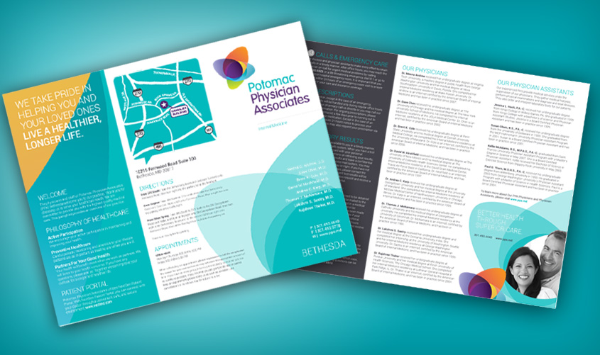
Right in the heart of Montgomery County, Potomac Physician Associates is a leader in healthcare. With state-of-the-art facilities in Bethesda, Germantown, and Kensington, PPA is home to capable, knowledgeable board-certified doctors who excel at patient care and leading medical practices. When PPA became a My Chief Marketing Officer client, they were in dire need of a rebrand and wanted an identity that would reflect the quality of care they provide. We came up with a vibrant and bright design for them that exudes vitality, health and the diversity of the practice.

Promaneer
Promaneer had an already-established brand, yet they were not happy with the direction in which it was headed. My Chief Marketing Officer took on the task of keeping their existing logo, but creating a whole new design around it. A new typeface was selected, and the logo was modified to include exciting new colors. Once the logo and color palette were designed, My Chief Marketing Officer moved on to designing the rest of the identity, marketing collateral, and their website.