
My Chief Marketing Officer Branding Portfolio
At My Chief Marketing Officer we are strategic branding experts. Through our comprehensive research process, we create unique visual brands for each of our clients. We provide you a visually pleasing and recognizable foundation to build your company’s image on and use across your multiple marketing initiatives. We invest ample time identifying your target demographic in order to create logos that resonate with them, hence helping distinguish your business from your competition.

GovTech
The Capital Group, the parent company of GovTech Insurance, tasked My Chief Marketing Officer with rebranding their organization, which provides insurance solutions to government IT contractors. Their old logo, shaped like a net, symbolized a safety net for contractors who might otherwise lack protection in the event of business losses while working with government agencies. We refined this concept, introducing a vibrant new color palette and pairing it with a structured font. This rebrand helped the company better position itself in the marketplace, allowing it to continue offering essential insurance solutions to government IT contracting companies in the DC metropolitan area and beyond.
East Diamond Brewing
East Diamond Brewing Co. approached My Chief Marketing Officer for a new brand after acquiring a historic brewing company and restaurant in downtown Gaithersburg, MD. Known for its rustic Americana ambiance and strong lineup of refreshing beers, East Diamond needed a brand that reflected its rich heritage. We designed a unique seal inspired by the nearby railroad tracks, tying the brand to its local roots. The warm, inviting color palette echoed the cozy atmosphere of the restaurant, a popular hangout for both locals and visitors to Old Town Gaithersburg and the historic train station just a block away.

MBA Growth Partners
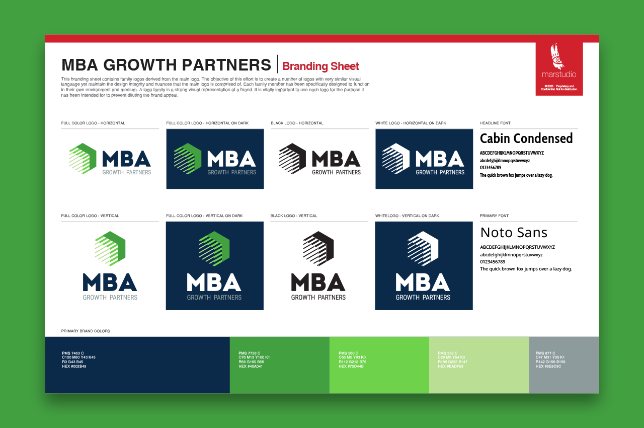
MBA Growth Partners approached My Chief Marketing Officer to redesign their outdated logo as they ventured into the competitive consulting industry. Their old logo didn’t position them alongside other top-tier consulting firms. We crafted a unique monogram that beautifully encapsulated their mission: three interlocking, upward-facing arrows formed from precise lines, symbolizing how they leverage data and information to build accurate insights and help clients achieve success. Paired with a strong, structured font, this new monogram elevated their brand, instantly making it synonymous with a leading consulting firm.

7&Up Club
Let’s Smile Dental approached My Chief Marketing Officer to create a new brand for their 7&Up Club, a program encouraging kids to pre-plan for braces as they reach the appropriate age. They sought a fun, engaging brand with merchandising potential that could easily expand into a visual language kids would relate to and want to join. We delivered a design that had all the ingredients for success: energetic, colorful, and perfectly tuned to resonate with children. The expanded visual language was carefully crafted from the initial styling, ensuring that the brand’s vibrancy would shine through in every piece of collateral.
TelSoul
TelSoul approached My Chief Marketing Officer with a bold vision: to become a global ministry. They needed a brand that matched their aspiration. We got to work and designed a logo that captured their mission, love, and sense of nation. A clean, crisp custom typeface with an embedded monogram gave TelSoul the credibility they needed to embark on their holy journey and spread their message of joy and acceptance. Additionally, we developed a new tagline and a powerful seal, expanding their brand language and equipping them with the visual tools to create a distinctive presence among established ministries worldwide.
ABC Garage Doors
ABC Garage Doors, a small local business, approached My Chief Marketing Officer for a rebranding initiative because they were struggling to be seen as a legitimate, experienced company. Their outdated brand presence was causing potential customers to question their professionalism. Despite a limited budget, we delivered a unique and polished design that successfully repositioned ABC Garage Doors as the leading service provider in their field, giving them the credibility they needed to attract new clients.
Comcentia
Comcentia, an IT government contracting company, approached My Chief Marketing Officer to revamp their outdated logo and website to better position themselves for larger federal, state, and local government contracts. Their old logo was a relic of the late 90s and early 2000s, signaling that they were behind the times. We got to work, creating a new brand identity and crafting a fresh tagline that established them as a premier player in the IT government contracting space. With this updated logo and color palette, Comcentia is now equipped to compete with much larger organizations, not just in capability, but in appearance as well—fully embodying the leading-edge image their expertise deserves.
Behavioral Framework
Behavioral Framework engaged My Chief Marketing Officer to refresh its logo and redesign its website. They were deeply attached to their original logo, and our initial concepts didn’t quite resonate with them. However, through collaborative efforts, we refined their existing logo, preserving its essence while elevating its impact. We complemented the refreshed logo with a new color palette that exudes confidence, trust, and tranquility—qualities essential to their work with children suffering from autism. The final result was not about reinventing the wheel but enhancing it, resulting in a logo that feels both familiar and transformative.
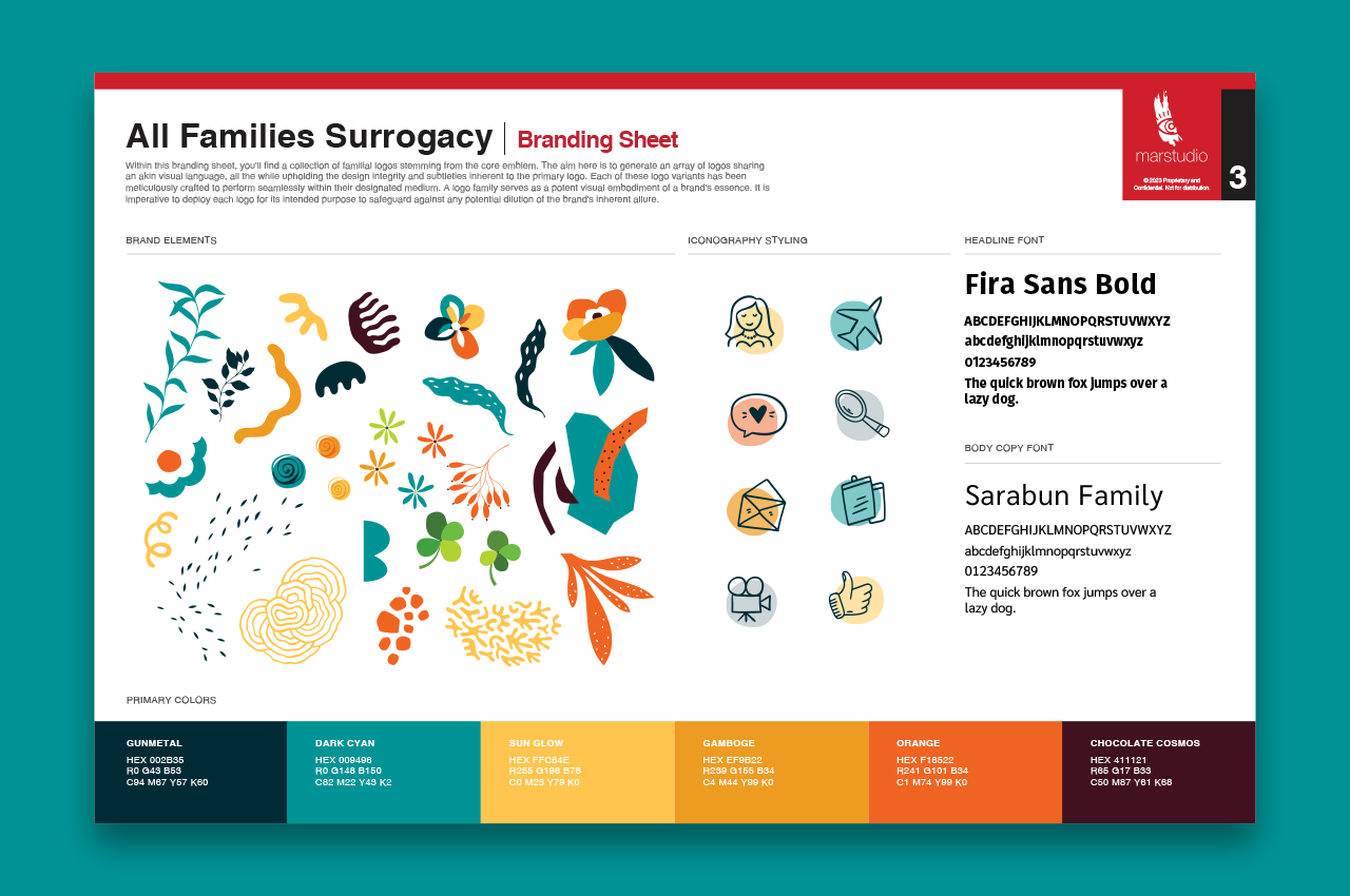
All Families Surrogacy

Uzima
Uzima approached My Chief Marketing Officer with an established brand, but it lacked the polish needed to compete with larger, more resourceful organizations. As a woman-owned and minority-led nonprofit, Uzima sought to strengthen its presence in the healthcare equity marketplace. We refined their existing brand elements, helping Uzima position itself as a formidable player in the industry and a significant force in the health equity landscape.

Veirs
Veirs Agency approached My Chief Marketing Officer to revamp their logo. As a long-standing family-owned business, they sought to modernize their brand and attract larger corporate clients. We designed a standout monogram that reflects their heritage and incorporates the letter V from their family name, symbolizing their evolution into a prominent insurance and bond provider. This fresh brand identity has resonated with their current clients and enhanced their competitive edge in the corporate insurance market.





CTS
When CTS approached My Chief Marketing Officer they already had a strong brand. However, they did not have a well thoughtout brand strategy that could help them dominate their logistics marketplace. We helped refine their existing brand and created an expansive brand language and corporate identity that has helped them expand their dominance in the furniture delivery industry.